Transforming Apple's Training UX
At Apple, exceptional design extends to internal tools and training platforms. This case study explores two transformative projects: one that streamlined a cumbersome publishing process into a single, efficient tool, achieving a 90% reduction in publishing time, and another that revitalized ATLAS, Apple's global training platform, through personalization, accessibility, and engaging design. By prioritizing user needs and embracing Apple's design principles, I created solutions that empowered employees to work smarter and learn more effectively.
Project 1: Apple's Publishing Power-Up
The Challenge
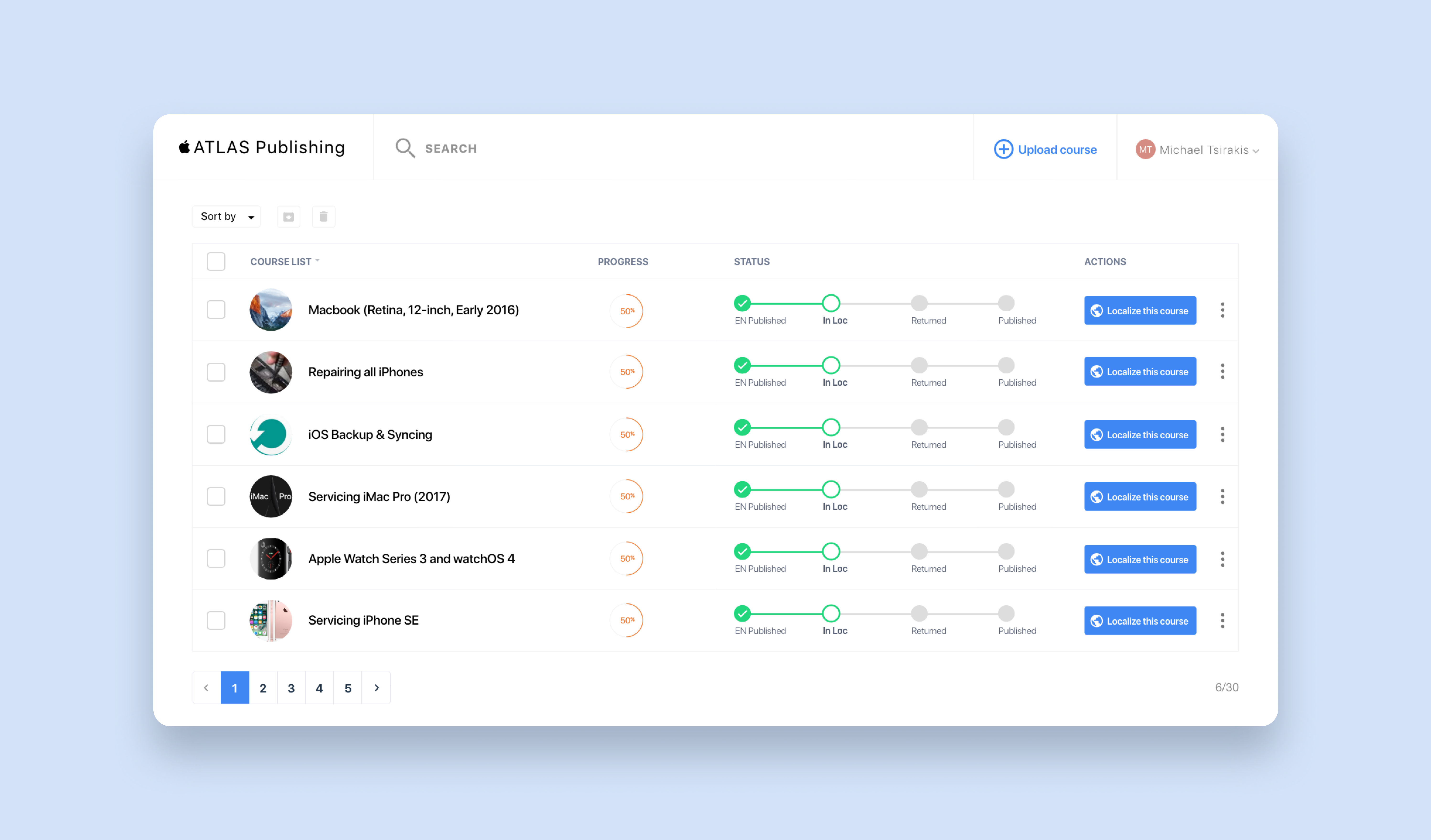
Imagine juggling three apps just to publish one course. That's what Apple employees faced, with the process taking anywhere from 10 minutes to days! They craved a smoother experience, bulk actions, and that iconic "Apple" feel.
UX Detective Work
I rolled up my sleeves and dove into a heuristic evaluation of the existing tool. Through usability studies and interviews, I got into the minds of the users: How did they really use this thing? After collecting user insights, I started sketching ideas for a user flow and screen designs. The goal was simple: make the complex intuitive. I iterated through countless versions, testing, tweaking, and refining until I had a design that felt right. This meticulous process was the foundation for the final app: a user-centric, efficient, and elegant tool.
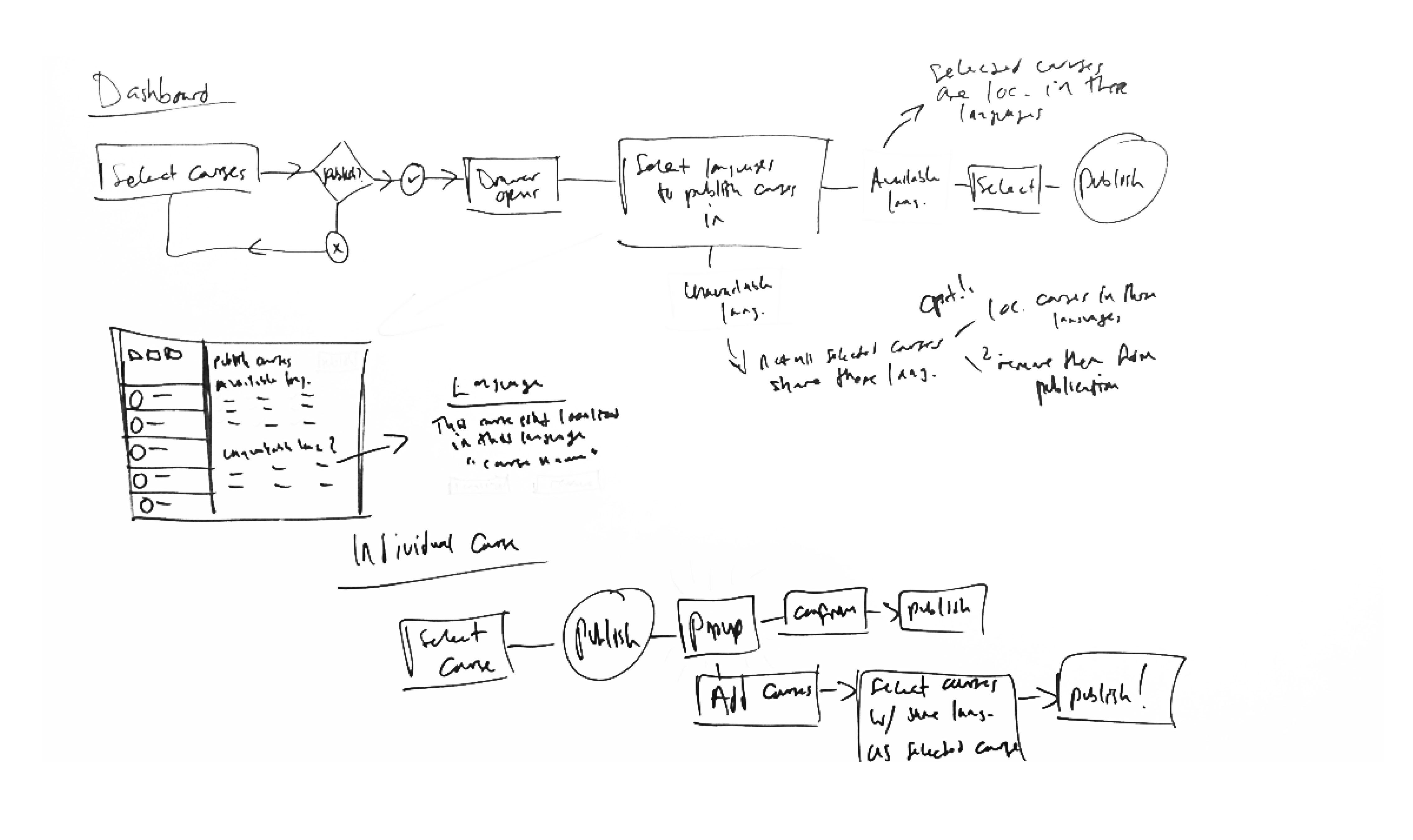
The Redesign Revolution
Out with the old, in with the streamlined! I merged those three apps into one sleek powerhouse and reduced the amount of time required to complete the publication process by 90%. Bulk actions became a breeze, wait times shrunk, and the UI got that much-desired Apple makeover.
The Impact
A 90% reduction in publishing time! What once felt like a chore turned into a fast, enjoyable process. Employees weren't just publishing courses, they were cranking them out, going from a handful to hundreds in a matter of hours.
Project 2: Apple's Global Training Transformation (ATLAS)
My Role + Team
As the lead designer on Apple's Field Service Training team, I was responsible for crafting both internal tools and consumer-facing websites for employees and external partners.
The Problem
The Genius Bar's secret weapon? Me and my team at Apple. We created the training that empowers global Apple store employees to fix iPhones, answer tricky questions, and wow customers. My challenge? A decade-old, clunky learning platform that frustrated everyone, from new hires to seasoned pros due to an outdated design, accessibility issues, clunky navigation, and content that felt stale and irrelevant. I reimagined it from the ground up, prioritizing accessibility, localization, and an engaging design that makes learning a joy – not a chore.
A UX Deep Dive
Heuristic evaluation and usability studies led the way again. This time, I focused on design and function, putting users through task-based scenarios to see where they stumbled.
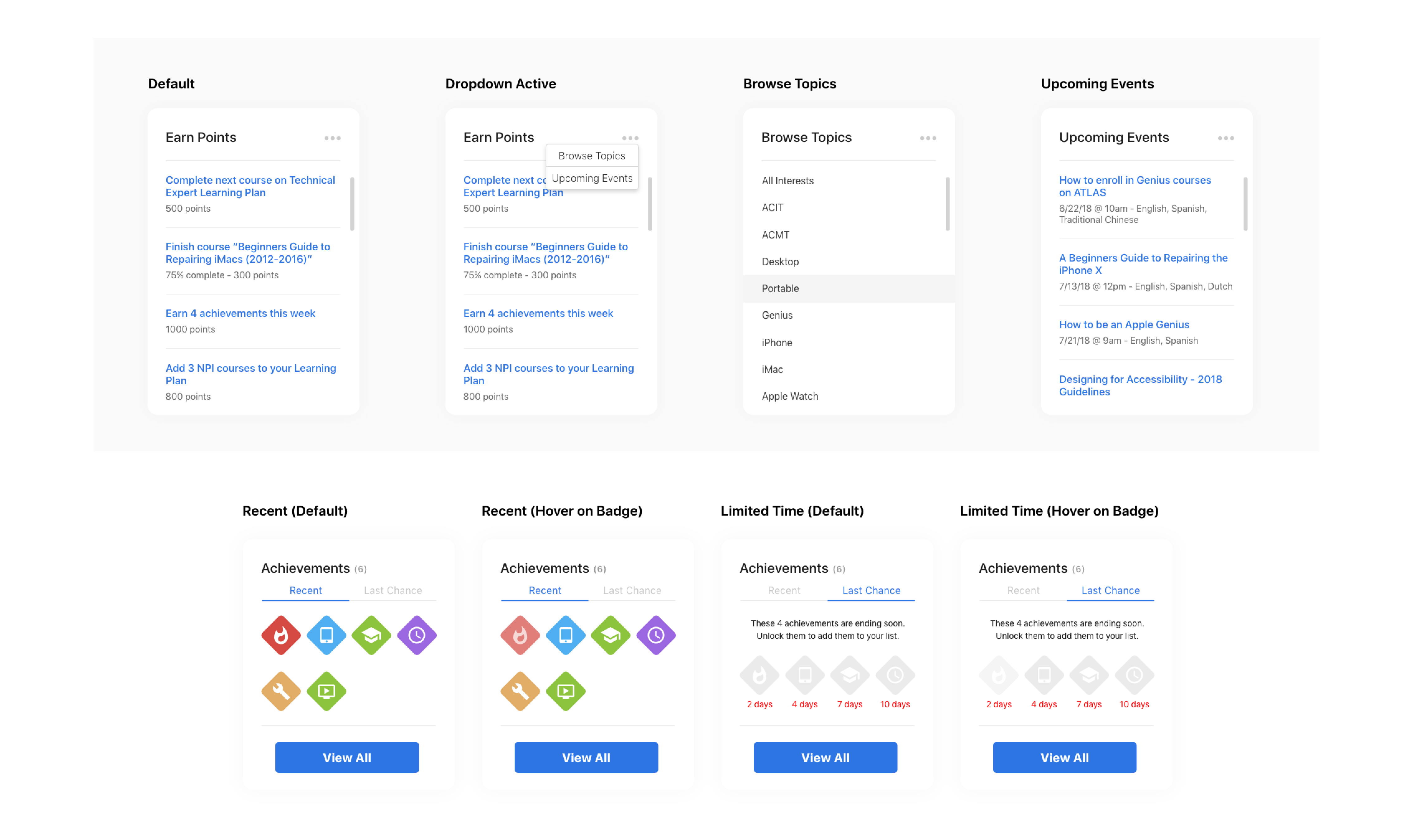
The Design Style Guide
A style guide laid the foundation for a complete UI transformation. Pages were built with meticulous attention to design consistency, functionality, and accessibility.
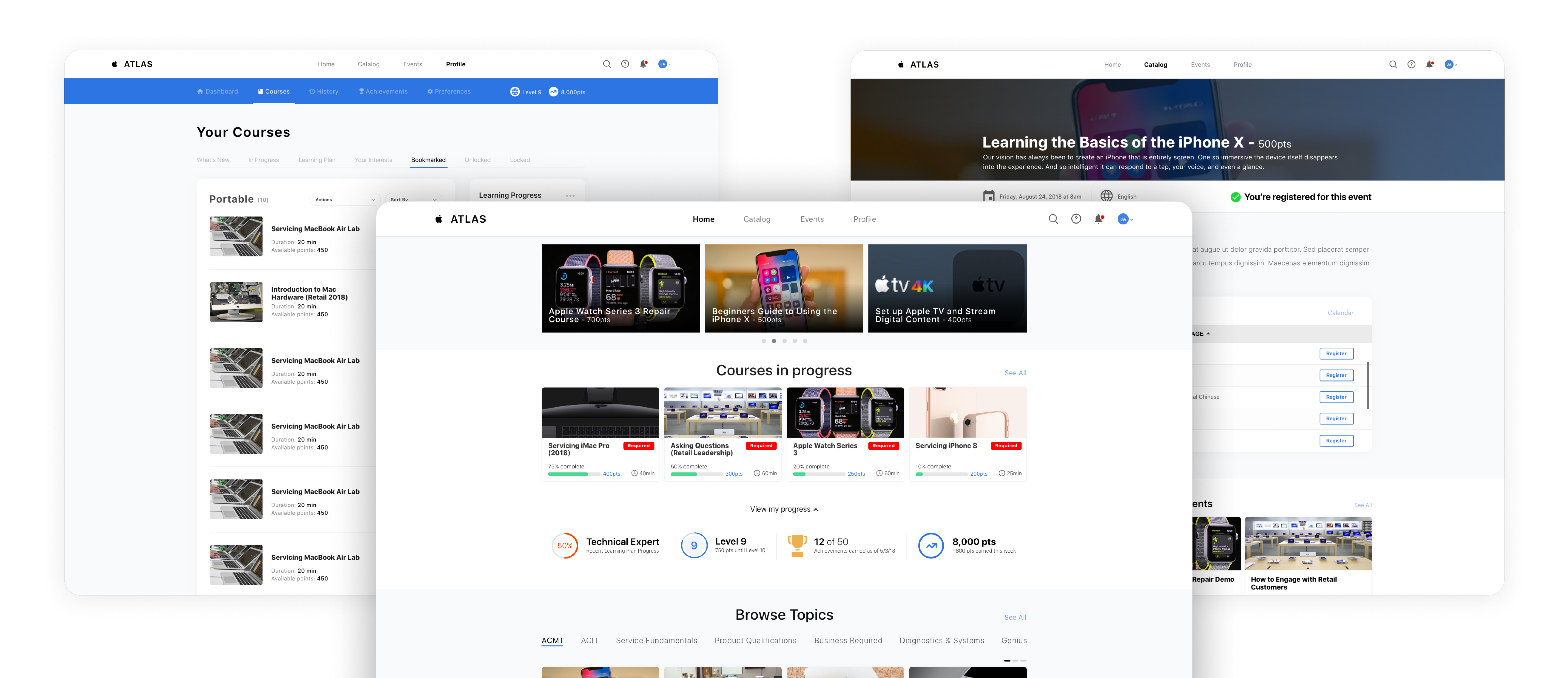
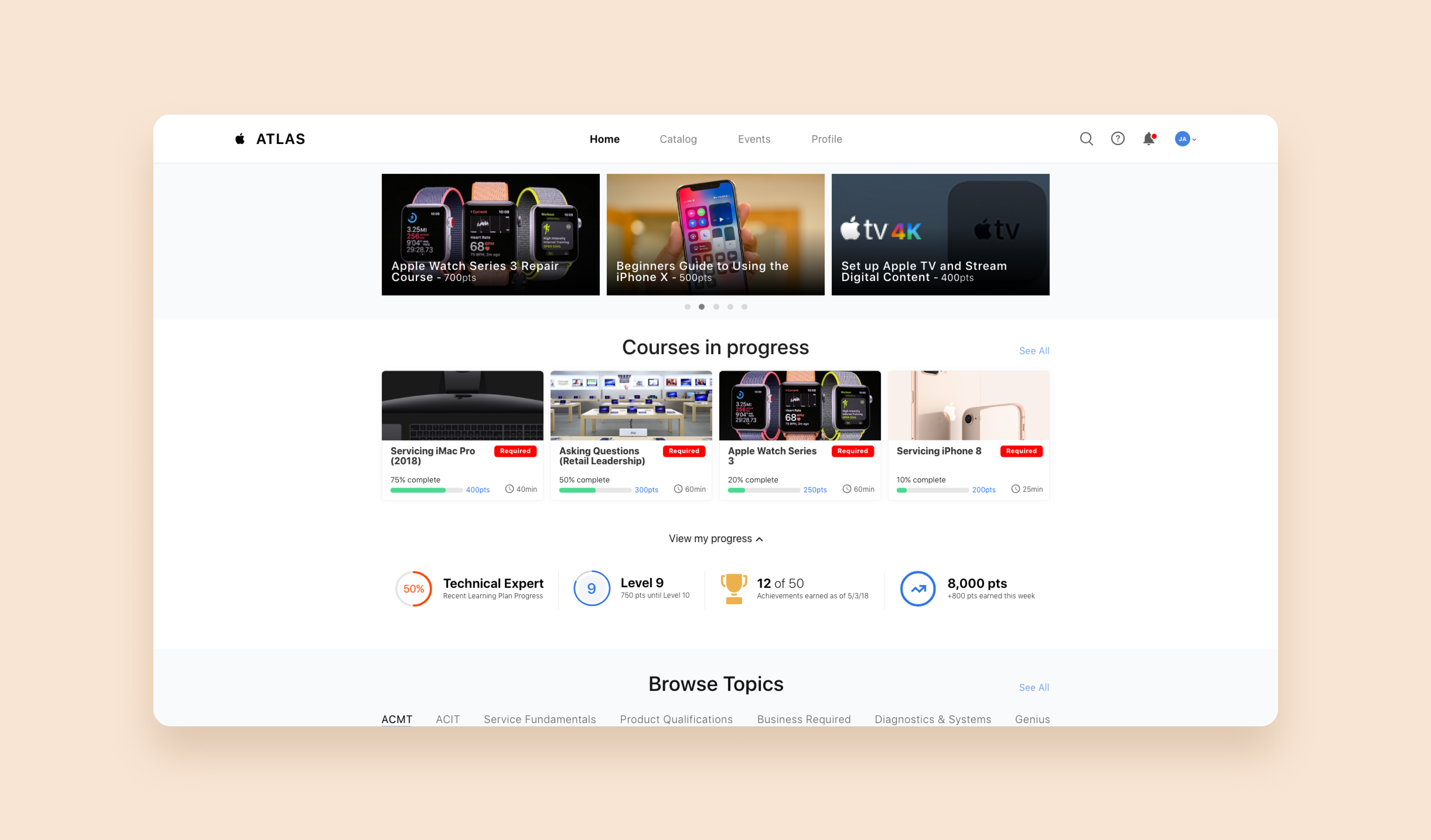
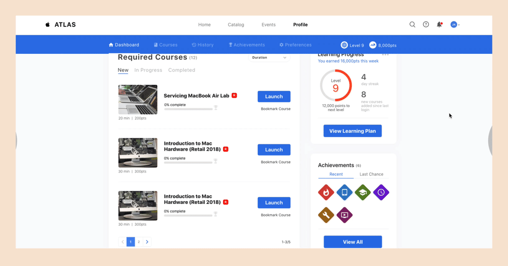
A New Way to Learn at Apple
The new ATLAS platform doesn't just have a redesigned UI, responsive layout, gamification, and improved functionality – it revolutionizes the learning experience. Instead of bombarding users with all content at once (a major pain point in previous versions), ATLAS welcomes each user with a personalized experience.
This innovative approach, informed by extensive interviews and usability studies, tailors the content to each user's individual needs right from the homepage. This approach significantly increases the value and effectiveness of their learning journey, ensuring they get the most relevant information for their role and development goals. With an additional focus on top-notch accessibility and engaging design, ATLAS sets a new standard for learning platforms at Apple, fostering a motivated and empowered workforce.
The Impact
Launched to 200,000 Apple employees globally, and ATLAS quickly grew to over 500,000 users within a week, including partners like Sprint and Best Buy. Feedback was overwhelmingly positive, with users praising the engaging design, improved functionality, and personalized approach.
You've reached the end of this case study!
If you made it this far, thanks so much for reading through this case study! Apple employees around the world are excited to learn with ATLAS, and that's the biggest win for me with these two projects.
Want to see more projects? Click one of the links below:
Next: "Google" - Revamping Google's Marketing Garage
Previous: "eBay" - Redesigning eBay's Returns Flow